Wednesday, August 26, 2015
The Mystery of the Modest Endorsement
Posted By Linda Stansberry @lcstansberry on Wed, Aug 26, 2015 at 1:57 PM

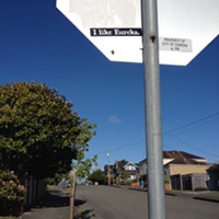
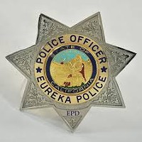
If you like Eureka, but don’t exactly love it, you’re in good company. In 2014 a few hundred stickers bearing the phrase “I Like Eureka” in stark white letters against a black background were mailed to local businesses and public officials. They still broadcast their message everywhere from Old Town coffee shops to the office of Councilmember Natalie Arroyo. The Eureka Police Department also recently began putting them on the backs of its squad cars.
Efforts to determine the origin of the stickers were unsuccessful. We called every print shop in town and turned up no clues. The return address on mailing packages linked back to the much-maligned Downtowner Motel, adding an extra layer of pranksterism. Some were addressed as being from “The Eureka Sanguine Society.” No such society exists in Eureka, but sanguine – meaning optimistic or positive – seems like a good way to characterize the slogan, which is cheerful without being so uncool as to be confident.
Just as our curiosity about that mysterious sticker whisper campaign had begun to fade, the lukewarm endorsement reappeared, this time on a flyer for the upcoming Neighborhood Watch Block Party. The branding nerds among us jumped to attention. What was going on? Had Neighborhood Watch co-opted I Like Eureka, re-packaging it in a peppier font? Or had the original sticker distributors had a change of heart and forsaken their gritty typeface and guerrilla distribution tactics to embrace the Establishment’s earnest vision? An email to the organizers of the block party yielded a clue – the flyers had been designed and the little green button added by local branding guru and Journal contributor Joel Mielke. What if? … we pondered. Mielke, owner of Carson Park Design, certainly had the resources and the chutzpah to send out the stickers.

So we called him. And he disappointed us. Neither he nor the Eureka Police Department (which, if anyone had the resources to track down the sticker trafficker, you’d think it would be them) had any idea where the stickers came from. But Mielke does know where the slogan came from, and it’s been around longer than you think.
Mielke first spotted it around five years ago on the lapel of then Eureka City Councilmember Jeff Leonard.
“I said, ‘That’s a bitchin’ button,’” says Mielke. “The cautious syntax struck me as very droll. I asked him where he got it, and he said that Patrick Rutherford had given it to him.”
So Mielke turned to Rutherford, a local insurance agent. Rutherford said he had purchased it at an antiques show in Fortuna several years prior.
“He had no idea how old these buttons were, nor what had inspired them,” says Mielke. “He says that they are metal with a plastic coating, which probably puts them anywhere from the early '70s on.”
And there the trail ended. We called Ben Brown over at the Clarke Museum, to see if they had anything in their database that would link the button to Eureka-boosterism from years past. The Clarke Museum did have one in their collection, donated in 2006, but no information about its context. Mielke says that, from a branding perspective, he likes the “innocence” of the slogan, the modesty of not being able to come right out and say you “love” a place. What was probably originally a square expression of civic pride has obtained a level of irony due to the commercial deluge of “I ♥ [insert city]” merchandise.

“Not that nobody understood irony back in the 1960s, but that wasn’t it,” says Mielke. “It looks like somebody came up with this do-gooder campaign, decided to boost the spirits of everybody in Eureka. It’s kind of innocent and ironic and straightforward and I kind of like the candor of it.”
The sticker version, featuring a distressed font Mielke has identified as a free download called “Blackbeard,” capitalizes on the irony of the modest, keen slogan by making it look like something a grunge band bassist would stick on his amp. Mielke, for his part, says he doesn’t really like the typeface.
“For me it looks instantly hackneyed,” he said. When he designed the block party flyer he returned to the clean lines of the original button. It remains to be seen whether the brand will be boosted or diluted by its renewed association with “The Man.” One thing’s for sure, however, which is that the public’s affection for the bustling metropolitan heart of the Redwood Coast is unlikely to swell into real passion.
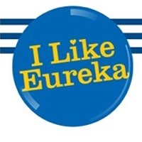
“The ‘I Love’ thing is so pedestrian,” says Mielke. “‘I Like’ is a nod to common sense. Who really does ‘love’ a place? When I originally designed the flyer they asked me if I could put a heart on it. But then it’s not funny.”
“I Like Eureka” buttons will be available at the Neighborhood Watch Block Party, this Saturday.
Related Stories
-
Controversial "I Like Eureka" Logo Given New Heart
Aug 26, 2016 -
New Subversive Graffiti Stickers Popping Up
Jun 1, 2014
Speaking of...
Comments (3)
Showing 1-3 of 3
Readers also liked…
About The Author

Linda Stansberry
Bio:
Linda Stansberry was a staff writer of the North Coast Journal from 2015 to 2018. She is a frequent contributor the the Journal and our other publications.
Linda Stansberry was a staff writer of the North Coast Journal from 2015 to 2018. She is a frequent contributor the the Journal and our other publications.
more from the author
-
Lobster Girl Finds the Beat
- Nov 9, 2023
-
Tales from the CryptTok
- Oct 26, 2023
- More »


